Tuesday, July 19, 2011

What to do with Crack

With the end of my work for Fables for Japan I'm now returning to work on Matt's Monsters and working on Charlie Ironpaw. The tight deadline I had for Fables and the extra push I had to do towards the end to complete my project on time brought home a fact I've been thinking about for quite sometime: My inking process takes way too long.
I've been inking pretty much the same way since High School. Basically I trace my pencils with a #3 micron pen, then erase the pencil, then trace over the now slightly faded ink with a #5 micron adding some line weight in the process. So essentially, I draw my drawing 3 times.
This is simply not time effective and since I'm primarily working on Matt's Monsters I decided it would be a good time to practice some brush and ink work when I can find time so that I'm ready to ink my comics when the time comes.
I have tried inking in the past but have failed due to lack of trust in myself and my impatience with the lack of control that comes with inexperienced brush work. My big attraction to the microns is that you can be so precise with them while brush work is often spontaneous. Never wanting to give one of my nicer pencil drawings up to the brush I would just go through the time draining micron process.
Over time I've come to appreciate the spontaneity that comes with brush work and it's elegance and flow that I see in other, more experienced artists work. I decided that it's about time for me to see if I can get it to work for me.
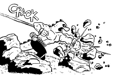
I have also decided that I need more practice drawing comic book poses referencing some of my favorite artists. The underneath drawing is a pose I ripped from Gerard Way and Gabriel Ba's Umbrella Academy Apocalypse Suite page... you know the book doesn't list pages but its on the third page of the third chapter. I inked this practice piece with a #1 round brush and black acrylic artist's ink.
For the most part I think it's a good start. I was able to control the brush for the most part and it was certainly quicker than the micron process despite how slowly I had to move to maintain control. I think it's lacking a real style but I imagine that will come as I get more comfortable with the brush. There were also minor details I struggled with and some shaky lines where I got nervous (his nose). The brush is also pretty old and I should really upgrade the ink but it's silly to think that materials would really improve my skills all that much. Once I get more practice and more comfortable then I can upgrade, after all there's no point in buying a Ferrari if you can't drive stick.
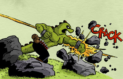
I colored it in quickly just because. While coloring it in I struggled to find a reason why I chose Crack as my onomatopoeia, especially in the place I originally put it. I moved it to somewhere that made at least a little bit of sense but whatever. Some good practice but I definitely need some more. When I can find time from Matt's Monsters that is.

Monday, July 11, 2011

Page 1 Final

And here's the first page all colored and textured up. I'm know putting the final touches on the rest of the pages and will be finished tomorrow. I had a lot of fun working on this and learned a lot of new things. I'm excited to see what the other artists have come up with. I'll let you all know when the book is out and ready to download to your ipads, nooks, computers and whatever else you may have, all to benefit the Red Cross' Japanese relief efforts.

Thursday, July 7, 2011

Fables for Japan Progress, page 2

The deadline for Fables for Japan is this upcoming tuesday and I'm wrapping up the coloring of my pages over the weekend and putting on the finishing touches. Below is the inked and colored versions of page two. The colored version is still awaiting texturing and what not but there it is.


Tuesday, June 14, 2011

Fables for Japan Part II

Here's the aforementioned re-sketching I did. I suppose this is a potential spoiler but I'm going to assume that only I can actually make enough sense out of this to understand what's going on. If you have super-human visual comprehension skills beware. These are what my normal page sketches look like.
As you can see it's very rough. Like I mentioned before I really prefer to work on the main page to give everything a fresher look.
And here are the pencils for the second page. As you can see here I'm a little more careful. I do a more detailed sketch/design with a blue col-erase pencil, then make my final pencil marks with a 4H pencil. These usually stick through the inking process but sometimes I'll go back and change things before or during inking.
If you look closely at the sketch version up top (page 2 is on the top, second from left), you can see I made a change from the panel 3 sketch version onward. Sometimes it takes me drawing out all the lines and boxes and penciling in a few panels to figure out something doesn't work in the sketch. Those i'll just change right on the final version, instead of making another sketch. Certainly makes things interesting, especially since I don't always pencil chronologically.
Finished penciling page 4 tonight, one more to go, then to finish inking and coloring. I'm getting more and more excited. Page 4 might be my favorite so far. Stay tuned.

Friday, June 10, 2011

Fables for Japan

Hello people. The following is all work on an anthology project I'm participating in to assist those affected by the disaster in Japan called "Fables for Japan". The book will consist of drawings, comics, and stories based or inspired by Japanese fairy tales. The book will be released digitally in three parts over the course of the year and solidly after that. For more information you can check out the project's facebook page here: http://www.facebook.com/pages/Fables-for-Japan/169318336462463?sk=wall

The comic I've created is about a mortally wounded samurai and his encounters with different creatures in an enchanted forest. Below you can see my initial character design and color study for the protagonist samurai.
When I first started working on the project, I had thought about using watercolors and inks, but because I haven't had enough practice with it, and a tight deadline, I decided against throwing a lot of time into something that may not work. Below is one of the tests I did in watercolor and ink on the demon character.
Here's the digitally colored version. The final comic will probably have some traditional elements textured in so it has a more natural look but for the purpose of a study I was happy with this.
Below is a sketch of the first page in the five page story. This was part of the series of sketches (along with the character designs and script) that I turned into Jason Minor (the project leader) for consideration. While I see the value in planning and sketching out scenes, I must admit I'm not a big fan of doing really elaborate sketches (and yes, for me this is an elaborate planning sketch). I like to use sketching to place my characters and do a bit of composition work but I usually just do it with a stick figure and a few lines. Working as a part of someone else's project however, it was important to have legible and cohesive sketches so I took them a bit further than I normally would. In my next post i'll put up the final sketches I did for myself so you can see how primitive they are (they're in ball point pen so they don't scan very well but whatever).
After reviewing the email packet I sent, Jason has some great ideas which I happily took. After doing the aforementioned ball point penned planning I got to work on the actually pages. Below is the final inked first page awaiting coloring. So far I've penciled in 3.3/5 pages and inked the one. It's not unsual for me to ink in a page or two even before I finished penciling. Probably not the best practice but I can't help myself. enjoy and please check out the project on Facebook and if you follow for continuous updates and other artist's work.


Monday, May 16, 2011

Charlie Ironpaw Page 1


Baltimore Comicon is in August so I've been trying to get some pages together to show. I went a few years ago when my story and art weren't as strong so I got to nervous and shy to show anyone so this year I'm trying to go in strong.
Did some flat colors on it to give an idea how it would look finalized. Colors really aren't my strong suit but I learn a little more every time.

Tuesday, May 10, 2011

Matt's Monster's Progress

I talk a lot about how I'm working on my children's book on this blog so it's only fair I show you all some progress. Here's my process for coloring my kid's book. I work on each page as a spread (2 pages that open together). First step is to scan in my drawing and open it on Photoshop, clean it up.

Step 2: Put the black lines on a separate layer and color in the lines on various different layers.
Step 3: Select the black lines using channel select and color in the lines on separate layers:
Step 4: Over lay watercolor wash textures I've made and scanned in on various layers
Step 5: Shade in the flats on all the various flat layers.
and that's how I color in each of my spreads and why it takes so so long. Each page ends up having somewhere around 30-60 layers. fun fun fun. I'm about half way done on the inner pages and will have to complete the cover and some spot illustrations after. just keep swimming.

Thursday, April 14, 2011

Dolores Umbridge

Who doesn't like justice? One of my favorite moments in the Order of the Phoenix is when Ron, Hermoine, and Harry are in the Infirmary making the horse hoove (how do you spell that?) noises to freak out the mis-fortunate Dolores Umbridge.

Looking back at that Skywalker image it def still needs some work. Hopefully I can get back to that at some point.

Monday, April 11, 2011

Luke Skywalker

Luke Skywalker drawing I colored in quickly. Might work on it a little more, might not. I'm getting really into quill tip pens as I work on my comic so I'm doing some work with those. And of course, still working away at coloring in my Children's Book.

Friday, April 1, 2011

Try, fail, try again.

So lately I've been doing a lot of character sketches but for the most part they've just been model sheety: boring with no backgrounds or anything like that. Over the last week I decided to work more on placing my characters into their environment and seeing how it works out. The opening to my first bit of comic takes place in a jungle so I figured I should start there. This was my first attempt. It wasn't until I began to color it in that I realized I hated it. Yes it was dense and had jungly plants in it but there was something missing I couldn't place my finger on. I also hated the colors I chose for the dinosaurs.


My second attempt, I decided to have the characters in a more engaging pose. obviously I also added a speech bubble. However the weak poses and speech bubbles fail to cover up a jungle that is still horribly wrong and for awhile I couldn't figure out why.

To ease my mind I drew this, it's not really related to this blog post's story line so skip ahead and come back later.
After thinking about it intensely for a few days I turned to two of the artists I admire most and looked at their work. Bill Watterson of Calvin and Hobbes, and more importantly for the purposes of my comic Warwick John Cadwell's Jungle which you can see on his flicker here: http://drawn.ca/archive/warwick-cadwells-100-panel-gungle/ . Right now Mr. Cadwell is my favorite artist on the planet and it's because of the way he manages density, shape, detail, figures, focal points, white space, space in general; his characters poses; the mood of his scenses, ah just everything I think he's golden. So anyway while looking at his work I saw that mine was seriously lacking a sense of depth, space, and shape and that my characters poses were hardly engaging (that I picked up from both WC and Watterson), so anyway I took a shot at what I wanted to be my opening page to my short comic. I will have to do it again because this was drawn in my sketchbook and not on comic book paper. (I took a picture of this instead of scanning it in so it's a little blurry. When I scan it it'll have to be in pieces so I figured I'd finish it first before I tackle that headache):

I was very very happy with this. You can see I borrowed alot of elements that Cadwell uses in his working and tried as much as possible to blend it in with my own work. As I continue to practice I hope they mesh more. I am currently in the process of adding line weight. I cannot wait to color it in.